


Your Website Looks Good—So Why Aren’t Customers Taking Action?
Post Date: October 27, 2026
Imagine someone landing on your website right at this moment as we speak, deciding whether your business deserves their money. What’s worse is that you're unknowingly giving them tens of reasons to leave. And this isn’t a hypothetical scenario! As per PwC’s survey, 55% of consumers blatantly denied buying from a company after having back-to-back poor experiences.
The problem here doesn’t lie in how your website looks. Rather, it’s the lack of proper guidance, which ultimately asks visitors to figure things out on their own. They cannot immediately see why your offer matters, whether you can solve their specific problem, what makes your brand credible, or what happens once they click. This leads to decisions being postponed, another tab being opened, and moving on from you.
If this has become a recurring event, it’s time to move beyond inspecting your website’s visuals. Here, we will be discussing a few reasons why users abandon your business midway and what you should be focusing on instead.
Table of content
The Value Is Not Clear Enough to Make Customers Care
Visitors Have to Work Too Hard to Decide
The CTA Is Asking for Too Much, Too Soon
Mobile Friction Is Quietly Killing Intent
Your Pricing Is Creating More Questions Than Confidence
Final words
The Value Is Not Clear Enough to Make Customers Care
People don’t just arrive on your website just to study your business. Rather, they hope they can know if you will be able to solve a problem they are struggling with. Now, imagine your website showing them the company history, broad service descriptions, or generic claims like “innovation” and “quality” first.
In such cases, you are actually forcing your customers to do the translation by themselves. From what you are offering to the reasons for considering it, they have to figure things out. This ultimately becomes a conversion problem way before they reach the CTA. That’s why you should work with the best website designing company in Noida to ensure the site’s opening message establishes the problem, commercial outcome, and reasons to believe quickly. Only then can the right visitors recognize the relevance and show interest in your brand.
Visitors Have to Work Too Hard to Decide
A customer seldom leaves due to one web element being imperfect. Rather, abandonment stems from the combined effort of making sense of the offer superseding the perceived value of continuing. Whether it’s finding the service details, understanding the process, comparing the options, or verifying your claims, every action becomes too cumbersome.
This forces visitors to open a new tab in their browser and let your competitor ease the decision-making journey. What you have to do here is evaluate your website as a sequence of questions. Start by finding the answer to what it is exactly, and then move to questions like whether it’s relevant for your target audience and what it will cost. Only by establishing answers in the right order can you ensure visitors won’t disappear before intent becomes action.
The CTA Is Asking for Too Much Early
Your Call-To-Action needs to justify the confidence a visitor is ready to put in your brand. Someone who is currently reading a service page for the first time might be willing to discover an example, understand the process, check pricing, or see relevant results. However, it doesn’t mean they are ready yet to hand over their phone number and commit to a sales call.
This is where several websites confuse the availability of an action with readiness for the same. So, a credible web design company in Noida always ensures a high-commitment CTA is positioned properly so that the site feels less like a sales funnel and more like a useful buying ecosystem. With their strategy, you can, therefore, give visitors a progression: learn, validate, evaluate, then engage.
Mobile Friction Is Quietly Killing Intent
It’s not just about buttons being slightly smaller than recommended design standards. Rather, the strife surfaces when the visitor has to pinch and zoom to read key highlights. In fact, it also stems from having to scroll through oversized sections for the CTA, dismiss repeated pop-ups, and fight a cumbersome form. When reported once or twice, these issues seem insignificant.
But multiply the event’s frequency by 100 mobile users, and the concerns can no longer be overlooked. That’s because mobile users are less patient and often have to operate the website on a smaller screen. The key here is to run a mobile audit with the help of the best web design agency in Noida. This specific approach will allow you to examine the entire decision path, and not simply if the website passes a responsive-design test with flying colors.
Your Pricing Is Creating More Questions Than Confidence
Customers will hardly ask you for exact price numbers before contacting your business. However, they will demand enough commercial context to decide whether it’s worth having the conversation or not. A completely opaque pricing tier automatically forces visitors to guess. At the same time, a vague “custom pricing” statement tells them nothing about the variables involved, while an unexplained starting package creates the opposite problem.
The better approach here is, therefore, to rely on your sales model, which includes package pricing, starting ranges, inclusions, and pricing factors. Only then will you be able to clearly explain how the estimates were calculated and evaluated for accuracy.
Final words
If the website is getting the desired traffic but falling short of enquiries or purchases, an immediate redesign is never the answer. Find the point where customer intent is breaking down. Just ensuring a credible-looking website won’t help you earn customers. This is where Bytelogic Technologies comes into play. Being a trusted website designing company in Noida, we will help you identify these gaps and build a website grounded in clear messaging, stronger UX, and purposeful journeys.
Recent posts
- One System, Multiple Departments: How ERP and CRM Can Connect Your Business
- Is Your Digital Marketing Budget Working or Simply Being Spent?
- What Makes a Mobile App Successful? Insights From Noida Developers
- From Google Rankings to Qualified Leads - Choosing the Best SEO Services in Noida
- Your Website Gets Traffic But No Leads? Here's What Could Be Wrong
Categories
- Best App Development Company in Noida
- Best Mobile App Development Company in Noida
- Best Web Design Agency in Noida
- Best Website Designing Company in Noida
- Best Website Designing Services in Noida
- Blog
- CRM Development
- CRM Software
- CRM vs ERP
- Digital Marketing
- Digital Marketing Company
- ECommerce Website Design and Development Company in Noida
- ECommerce Website Development Company in Noida
- ERP and CRM Software Develpment
- IOS App Development
- Mobile App Development
- Mobile App Development in Noida
- SEM Services
- SEO Service
- SEO Service in Noida
- SEO Services
- Web Design Company in Noida
- Web Design and Development
- Web Development
- Web Development Agency in Noida
- Website Design
- Website Development
- Website Development Company in Noida
- YouTube SEO
- paid
Related Blogs
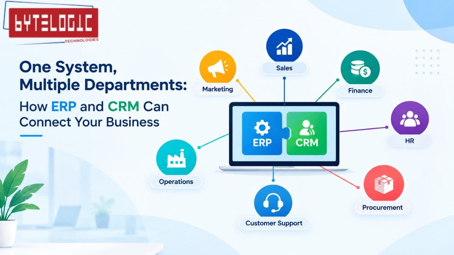
One System, Multiple Departments: How ERP and CRM Can Connect Your Business
Read Artices ↗
Is Your Digital Marketing Budget Working or Simply Being Spent?
Read Artices ↗

What Makes a Mobile App Successful? Insights From Noida Developers
Read Artices ↗